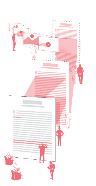
The way we read has changed. For most twenty-first century readers, reading is a multimedia and multi-platform activity; a cognitive and material interweaving of texts, images, texts as images, and images as texts. The problem in this change, as I see it, is not that contemporary users of textual artifacts do not “read” in the traditional sense of the word, but rather that existing texts are ill equipped to enrich the reading experience and accommodate these users. As such, the editorial designer’s new opportunity and responsibility is to define new ways to deliver old but culturally significant texts — the so-called “literary classics”— to these users. It is time to evolve the book, and this was the challenge of my Master of Design thesis project.

I began this project at Emily Carr owing to my undergraduate background in literary history and theory. My intent was to use design methodologies to deliver classic texts to a generation that grew up with stories like J.K. Rowling’s Harry Potter, told through multiple media touchpoints: print books, fan-generated content, web-based medias, films, and video games. This is my generation. We are what Douglas Rushkoff calls the screenager generation [3]. To some scholars and more skeptical professionals in literary education, the attention span of this generation is extremely limited. Our ability to engage with any text at a critical level is, supposedly, lesser than our counterparts prior to the mid-twentieth century. For other researchers and professionals, the issue is not as clear-cut as, “the kids aren’t reading”. To them, the kids are reading differently. Indeed, my interviewees for user profiling have demonstrated that reading is alive and well: the internet is, for the most part, text. N. Katherine Hayles proposes a synthesis of digital reading behaviours with non-digital reading behaviours, and suggests that both digital and non-digital reading behaviours. A synthesis between the two is key to effective pedagogical advancements in literacy [1,2].
With that in mind, how can texts be brought to life for users in ways that their original codex forms often fail to do? With the growing number of ebook forms, the possibilities of the digital text are endless, so much so that the term ebook begins to lose meaning. It is easy to imagine the graphing of UX structures from game design onto an ebook adaptation, and how these structures might shape the text itself into something far removed from its original form. Moreover, the designer’s role in this particular publishing process is changing. Editors, developers, and publishers increasingly see the value and deeper applications of designerly techniques and strategies. This space is quite bountiful, and many studios currently work within this space, including Inkle, Simogo, and Loud Crow Interactive.
My initial exploratory prototypes experimented with radically different modes of delivering and reimagining a text, including gamification and social reading, but I realized that these approaches were not quite what I had initially intended. Often, these adaptations involve rewriting and abridging portions of the text in order to grow or fit gameplay structures into the narrative. On a grander scale than my own prototypes, this kind of adaptation is demonstrated in Inkle’s Frankenstein app, which is a choose-your-own-adventure adaptation of Mary Shelley’s nineteenth-century text. If we refer back to Shelley’s original, we might realize that Inkle’s app is not the book equivalent of the penny-farthing’s evolution to our contemporary bicycle. Rather, it is the book equivalent of bicycle to automobile. Readers no longer pedal themselves through the text. Instead, Inkle’s rewriting is a motor that propels the reader through the text, much as a film adaptation might propel users through a narrative while the text itself is discarded or diluted.
This is not to say this kind approach to designing for classic literature is categorically “bad.” Nor is this to moralize extensive editorial interventions to the original text to the point of oblivion. Indeed, we often forget that many of Shakespeare’s plays existed as folk stories before they were written for stage production. As original and adaptation, both Shelley’s text and Inkle’s app are valid forms to experience Frankenstein. However, they are also fundamentally different modes of experiencing the same narrative, and their example is the beginning of a vast landscape with many opportunities. As the book and reading behaviours continue to evolve, and culturally significant texts continue to age, designers that work within this space will be confronted with this question: how will they evolve the representation of literary classics alongside changing user behaviours?
Many studios, publishers, artists, and directors have produced and are producing re-imagined retellings of old stories through gamified storytelling apps, comics, graphic novels, amplified ebooks, and films. Editorial design for existing texts is now a wide gradient of media. The varied combinations and handling of this media results in a variety of solutions for user engagement with these texts, and such was the fundamental problem of my thesis project. I chose to design a system for an enriching experience that would not involve a complete upheaval of the original text. I intended to design a book wherein paratextual content and multimedia serve as integral components of the experience and text itself, rather than UX and UI add-ons. The particular design of the interface was to structurally synthesize text with paratext, and glyphs with imagery. These principles informed the research of content for the project, focused the project’s visual language and form and, ultimately, helped define the changing role of designers engaged in similar projects as proposed in the framework developed in my thesis.
The framework’s application in industry implicates a process of collaboration with an editor, with the editor acting as a facilitator to content research and the designer as primary determiner and executor of content. However, within the time and resource constraints of a short graduate degree, I acted as both designer and editor. Three criteria were considered while selecting a text for this project. The first of these criteria was readability. Although this project specifically deals with older literary works, and such works often come with their own linguistic challenges, some of these challenges are not easily surmounted outside of the literary history classroom or without translation. This includes virtually anything written prior to the mid-eighteenth century, so I first cut my choices to post-1750 texts. The second of these criteria was copyright free texts. Together with the first criteria, this limited my choices to works written between 1750 and 1900.
The third criteria was a great deal more subjective. I saw the delivery of paratext and context — the worlds that surround these texts — as the primary opportunity to stretch the possibilities of the book and to ultimately offer engagement for contemporary readers. This meant that the texts and paratext in question were to be vetted according to the interest of their content to young adults. Some texts and paratexts are inherently more compelling than others; as such, I sought for a text with a degree of controversy behind its publication. I chose Oscar Wilde’s The Picture of Dorian Gray, a book that was widely censored due to its allegedly homoerotic content.
Paratexts and contexts offer a range of possibilities beyond the traditional editorial footnote in both content and presentation, and the filtering and execution of these possibilities requires further collaboration between designers and editors. Within the context of Dorian Gray, an academic editor might identify four major paratextual or contextual threads that run through the text: a social history of artistic culture in Victorian London, tenets of aestheticism — a philosophy to which Oscar Wilde adhered, references to classical mythology, and issues of homophobic censorship that include Wilde’s scandal and trial. The footnotes that one might find in an academic edition are fairly obvious, and the layouts begin to piece themselves together in the same way one might design a print codex. However, these threads provide us with a wealth of material that might be further editorialized using design tools and techniques. The communication design of this content provides the designer plenty of room to explore, experiment, and weave into the text itself via both tone and form. These threads may be made manifest typographically, diagrammatically, and graphically through a myriad of UI solutions, both static and dynamic. Online journalism has only begun to tap into these possibilities through dynamic infographics and photo essays that run parallel to feature-length articles. I see further applications of these techniques in editorial design for these texts. For this reason, and given contemporary user’s primary mode of text data intake, I produced my prototype using web-based technologies.

The weaving of these threads into the text is a particular challenge. Digital medias offer a means to balance paratextual or contextual content for the purposes of enrichment, rather than distraction. Marginalia can often physically take over a text in print, but similar content can be subtly revealed using new production technologies. In the case of Dorian Gray, censored material may be presented in ways unavailable in print: a tap on a word reveals inline editorial revisions, and the text thereby exists in multiple forms — edited and unedited — within a single delivery platform. Classical mythology might be explicated graphically and brought to surface at the user’s will, social histories of artistic culture in Victorian London might be mapped at given intervals in the text, reactions to the text’s homoerotic content might be rendered in expressive type when relevant. Each of these are layered as interpolated stories within the final prototype of this project as a literal opening of the text to reveal content within, but I see this only as the beginning.
I hypothesize there are further possibilities to layer a book using digital media that do not involve a complete upheaval of the original text itself. With the publishing industry in chaos, it is up to designers and editors to collaborate and offer readers a deeper experience. Now is the time for the designer to be as involved in a book’s content as an editor, and to collaborate with editors beyond the scope traditionally afforded to them in the publishing industry as we know it.
Some assert that digital texts will never replace the print book. This may be true. A print book will almost always preserve the silence of a text and the intimacy of the lone reader. In many cases, users need and want this intimacy, particularly in a day and age wherein it is difficult to escape from the comings and goings of our hyper-social world. However, if an digital publication of a book offers modes of enrichment that extend deeper than gamification, deeper than graphic novels, and deeper than film adaptation, we truly begin to break new ground. We begin to evolve the book itself, electronic or print.
References
- [1] Hayles, N. “How We Read: Close, Hyper, Machine.” ADE Bulletin 150 (2010), 62–79.
- [2] Hayles, N. “Hyper and Deep Attention: The Generational Divide in Cognitive Modes,” Profession (2007): 187–199.
- [3] Rushkoff, D. Playing the Future: What We Can Learn from Digital Kids. Riverhead Trade, New York, NY, USA, 1999.