Information design is an ethically motivated approach to designing. It is ethical because it recognizes the people addressed as different from the groups that create the communications. Awareness of the differences, however, is indispensable but insufficient. It motivates the approach, but to execute it in an effective manner it becomes necessary to engage in user research. User research includes many aspects and involves many methods, tools and approaches that help overcome our usual ignorance about the real nature of other people, their motivations, their sensitivities, their needs, their perceptions, their possibilities and their limitations.
There are two basic modes of user research in design: a) bibliographic, studying the perceptual, cognitive, cultural, behavioural and psychological issues involved in communication, as well as the kind of problem confronted; and b) interpersonal, interviewing, observing, working together, meeting and analysing people in action.
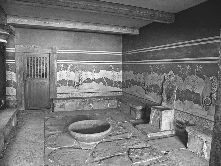
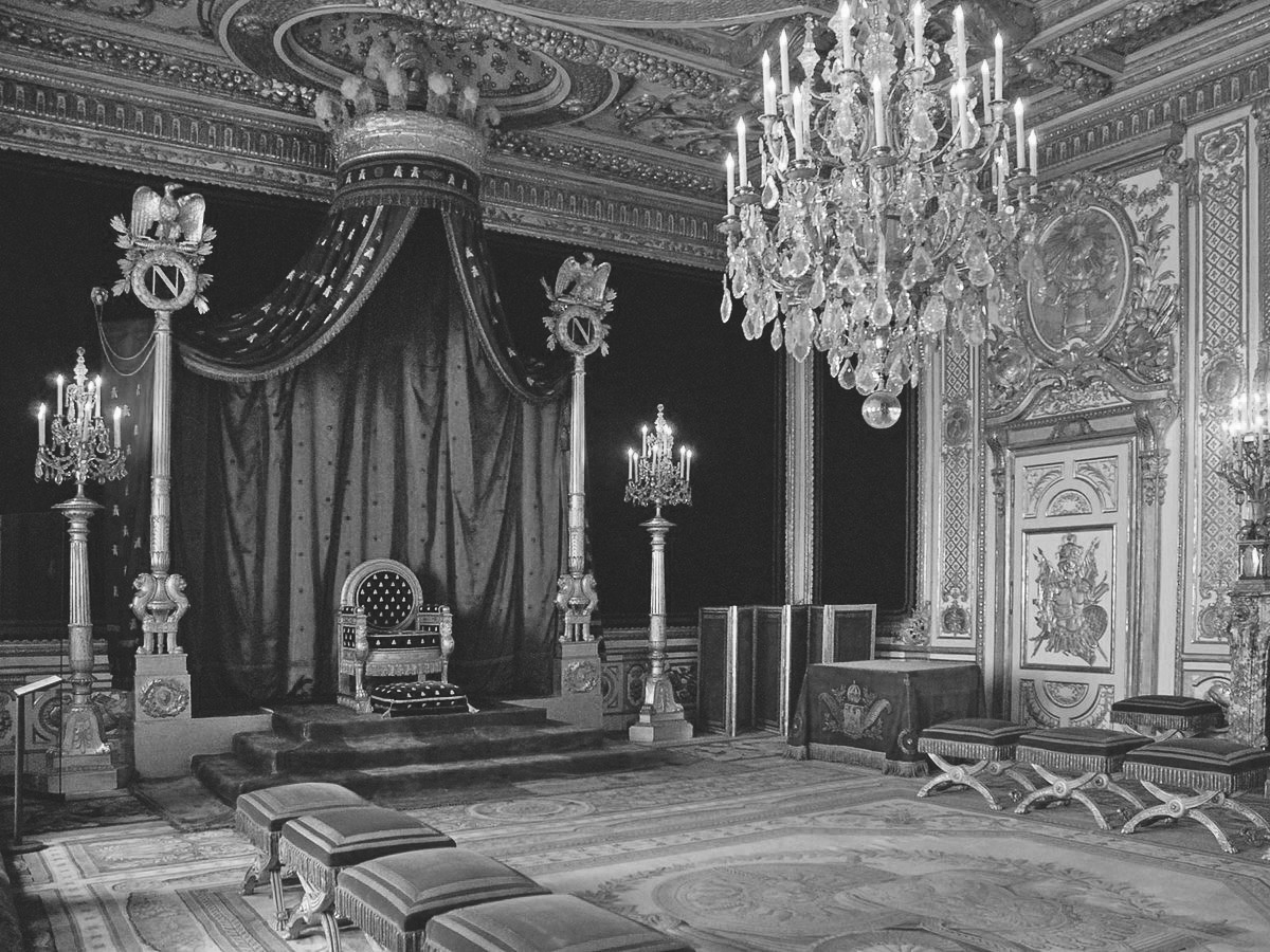
As designers that craft messages to be deployed in the public space, we have to be aware that our messages operate at two levels. One is conscious, and is the reason why a project comes to be: a need that has been perceived, identified and defined, and that has to be satisfied. The other is not conscious, and is connected to the way in which the communication is planned and crafted. Ways of communicating create models that eventually become assumptions and habits. A respectful way of communicating creates a paradigm that leads to positive processes of socialization. The forms of things express the beliefs of the makers and affect people’s behaviour. A clear example is the comparison between the throne of the king of Knossos, product of a minimally hierarchical commercial society (Figure 1), and the throne of Napoleon (Figure 2), a strongly hierarchical one. The difference between the seat for the leader and the seats for the members of council says a lot about the power differences they represent, and also affect the behaviour of the room users. [1][2]
As designers that craft messages to be deployed in the public space, we have to be aware that our messages operate at two levels.
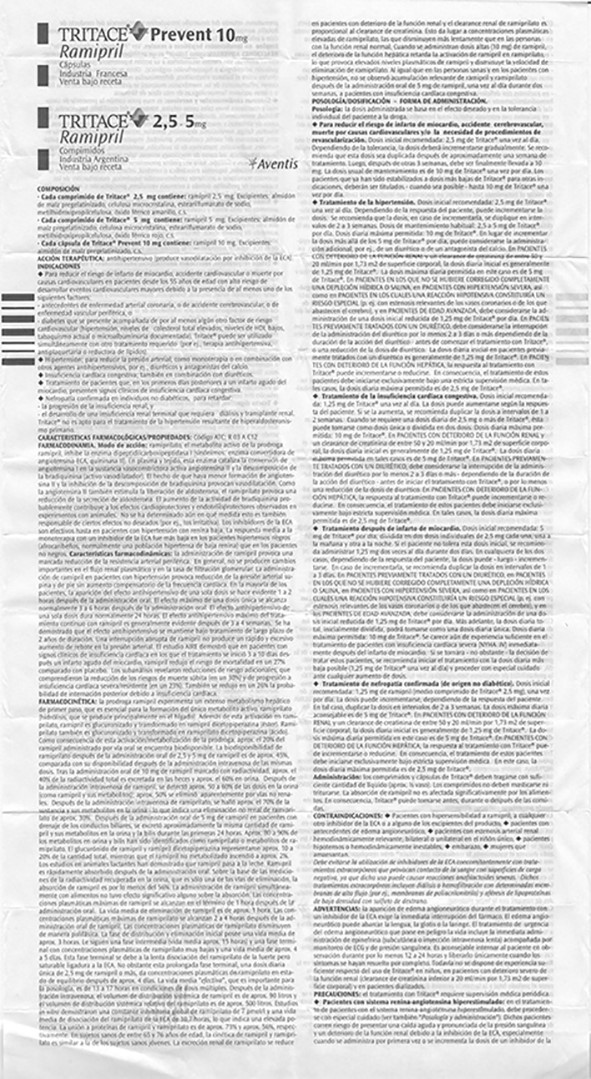
The same happens with information design: visual appearances elicit immediate emotional reactions. One feels welcome or put-off. This happens all the time with contracts, government forms, or many other legal documents whose content and presentation are cognitively and visually overwhelming. The visualization of information conditions our feelings and our behaviours: a bad solution to an information design problem (medicine leaflet, Figure 3) is not information design, because it does not support reading and understanding, hence it does not facilitate access to information, nor does it support memorization and use. In addition, it makes users feel incompetent or visually impaired.
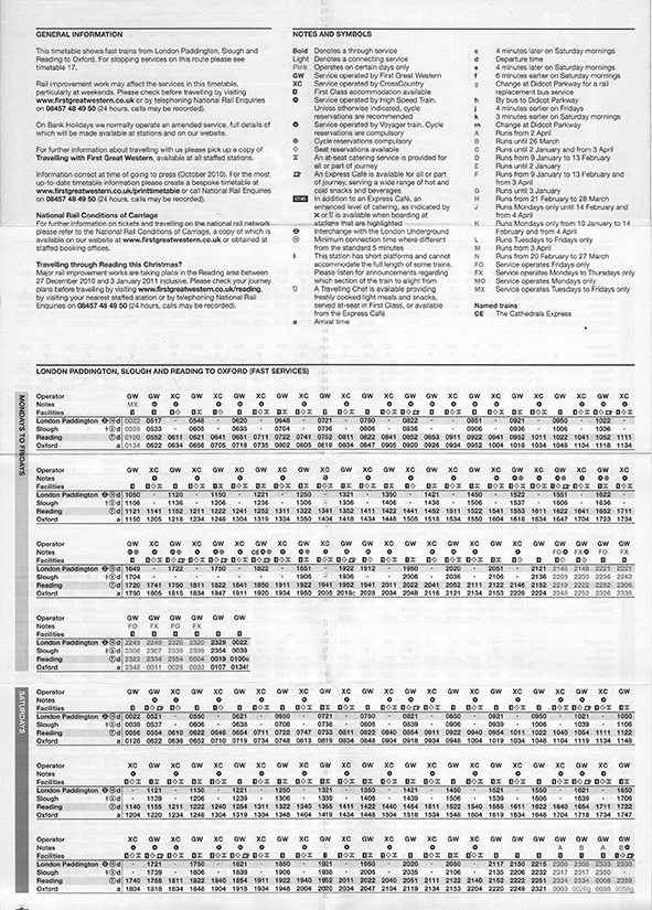
A good solution to an information design problem (UK railway timetable, figure 4) is information design, because it supports quick reference, has a comprehensible code, and comes in a type-size that responds to optometric values for comfortable reading.
Human-centred, ethical and empathic design takes form in matters of principle, but also in a number of micro decisions that aim at facilitating the users tasks, making information accessible, attractive, relevant, readable, understandable, complete, accurate, timely and usable [3] This involves considerations of human perception [4][5] attention [6], cognition [7], reading [8], learning [9] [10] and behaviour, just to mention the more important factors. These considerations affect type selection [11] [12] [13], type size [14], [15] [16] [17], layout, line length [18], visual hierarchies, language [19], information chunking [20], information sequence, language editing, use of colour [21] [22], use of images, relations between images and text [23], document type, document size, and medium. Design decisions are developed in an iterative process that begins with a participatory approach to studying the problem and planning the design response, and reaches maximum interaction during the development and testing of prototypes.
My approach to design
The first issue to think about when undertaking a project is its relevance. Does the project matter? Does it matter to users, to the community, to society? Relevance is a key issue in the ethics of design.
Once that point is taken care of, my approach to design focuses on impact, not on objects; on performance, not on looks. Our task as designers is not that of “form-givers,” a term popularized as a direct translation from the German “Gestalter,” which now translates as “designer.” Objects, looks and forms are means that have to be used to help achieve the objectives pursued. One has to master them, but they are not the focus of designing. The focus of designing is to achieve the change one is pursuing, a change that involves an improvement of something tangible or intangible for the interested parties, a change that centers on people. This often involves changes in objects, habits and behaviours, and represents the most difficult challenge designers confront. The only way to face this challenge is by involving representation of all people involved in different aspects of a project, so as to capitalize their collective intelligence, because as designers we do not work for clients and users; we work with them. [24]
To do this, we apply a wide variety of design and research methods that support the work at four stages: 1) generation of ideas through an understanding of the problem, the objective, the users and the situation of use; 2) development of prototypes; 3) Implementation; and 4) Evaluation. [25] [26] [27] [28] [29] [30].
An information design example
Working in Italy with Guillermina Noël for a campaign to reduce antibiotic abuse, the client gave us a model to use as a basis for our design. The key message of this model was: “Let’s leave the physician decide when (the antibiotics) are necessary.” (Figure 5) This type of message positions the doctor as an authority, turning the patient into a passive receiver of an order.
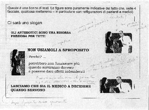
“Antibiotics are a precious resource for everybody”
“LET’S NOT USE THEM WRONGLY”
“Why? …”
“Because they might no longer work when they would really be necessary, and could produce undesirable side effects”
“LET’S LEAVE THE PHYSICIAN DECIDE WHEN SHOULD THEY BE USED”
Our cover’s text (Figure 6) was simplified, to explain clearly which was the problem to contend with, as opposed to the mixed messages of the proposed cover. Our type of solution keeps present the limitations of people’s cognitive capacity. However, making things easily understandable is not only a cognitive choice: it is also an ethical choice, because it allows the user to feel competent and comfortable, and therefore respected and confident, in front of the information. This is emotionally important for the reader, because, deep inside, not understanding a text is like not understanding one’s environment, an indispensable condition for survival.
Unfortunately, we were not able to convince the client to use just one message, not two: “The antibiotics can be good, but they can also be bad.” Defenders of antibiotics in the client’s group did not allow that. At least we managed to simplify the cover’s message.

With regards to the inside, the proposed solution was as follows:

We changed the brochure into a shared decision-making tool, something that supports a conversation between patient and physician, helping patients see that there were three possible scenarios: 1, when the antibiotics are useless; 2, when it is better to wait two or three days to assess whether the infection is viral or bacterial; and 3, when antibiotics are required. Explanations follow each heading.
The patient, in conversation with the physician, is to understand under which conditions the antibiotic should or should not be used. Our final design (Figure 8) showed these three scenarios clearly, as opposed to the sketch that was proposed to us, which had 14 paragraphs. This change brings to mind the concept of the designer as “transformer,” coined by Michael Macdonald Ross and Robert Waller when working at the Open University in England in the late 1960s [31].


This design process can be summarized as follows:
- Define with clarity and precision the main objective of the project (in this case, reduction of antibiotic abuse aimed at reducing the development of resistant bacteria).
- Understand why the problem comes to exist (in this case why physicians prescribe an antibiotic even in cases where they know that it is not necessary or useful. This requires understanding social and other factors that affect their decision).
- Understand the needs, perceptions and expectations of the full spectrum of users (in this case healthcare providers, patients and families).
- Plan a set of tools (Figure 9) that make use of the different opportunities that exist to make an impact on the current situation and achieve the stated objective (in this case: a) a brochure/prescription fold-out to help the dialogue between physicians and patients, b) a pocket size brochure to leave in waiting rooms and pharmacies, and c) a poster–in two sizes–for pharmacies and waiting rooms).
- Design prototypes and evaluate them with the client and the public.
- Implement and measure the impact by means of: a) comparing the average number of antibiotic prescriptions issued in the three months preceding the intervention, to the average number prescribed during the three months of intervention; and b) measuring the reduction of prescriptions in a control zone of a similar region where the intervention did not happen.
- Results showed an 11.9% reduction in the intervention zone, as opposed to a 7.4% reduction in the control zone (demonstrating that there is a generalized interest in the topic in the whole region but that the intervention area showed a stronger change), and a 3.2% reduction in the rest of the country (demonstrating that the region in which we worked was a leader in the efforts to reduce antibiotic abuse).
The graph below shows another way of summarizing the design process very briefly:
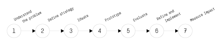
1) Understand the problem.
2) Define strategy.
3) ideate.
4) Prototype.
5) evaluate
6) refine and implement.
7) Measure impact
In addition to the specific results achieved, the project proposed a more ethically-oriented model of relation between people and information, as well as between people and people. This is what can be seen as an act of positive social innovation at the micro-level, thanks to seizing the opportunity offered to information design by a healthcare need.
Another example
Some times, as Mies van der Rohe said, “God is in the details.” Establishing the right tone of a message so that people adhere to recommendations is key to gaining attention, acceptance and use. In a recent project that Guillermina and I worked on designing a medical document, the original text read:
“4 days before your test”
“Start the low-fibre diet”
We changed it to:
“4 days before your test”
“Please start eating low-fibre foods and keep eating them until one day before your colonoscopy test.”
In both documents there is a list of low-fibre foods to eat and foods to avoid. In our re-design the low fibre foods were illustrated by a photograph, reinforcing the verbal message. The more conversational tone of our text is welcome by patients.
Conclusion
When information design is focused on the users’ needs, is ethical and practical, it respects people and helps them in their daily life. Access to information should be regarded as a human right. Information design should not be seen as an option, but as a necessity. [32]
Information design is not only hard, focused, precision-‐driven, cognition supporting work: it is also joy. The joy of learning more about people and communication with every project, and the joy of helping people achieve their goals. But this requires two conditions: 1) The will to help others (an ethical motivation); and 2) Sufficient knowledge to be able to do it.
I believe that through this kind of ethical, user-centred, systematic, socially conscious approach, much can be gained not only regarding the specific objective of a project, but also regarding the promotion of interpersonal models of relation that lead to a more respectful and fairer society.
References
- [1] Lakoff, G. & Johnson, M. Metaphors we live by. Chicago, IL: University of Chicago Press, (1980).
- [2] Hall, E. T. The hidden dimension. New York, NY: Anchor books, (1966).
- [3] IDX. Information design: core competencies. Vienna, Austria: IIID, (2007).
- [4] Appleton, J. The experience of landscape. London: John Wiley & Sons, (1975).
- [5] Koffka, K. Principles of Gestalt Psychology. Abingdon, UK: Routledge, (1935-2013).
- [6] Oberly, H. S. The range of visual attention, cognition and apprehension. American Journal of Psychology, 35, (1924). 332.
- [7] Miller, G. The magical number seven, plus or minus two: Some limits on our capacity for processing information. The Psychological Review, 63. (1956). 81–97.
- [8] Schiepers, C. Global attributes in visual word recognition. Nijmegen: Centrale Reprografie, (1976).
- [9] Dixon, P. The processing of organizational and component step information in written directions. Journal of Memory and Language, 26. (1987). 24–35.
- [10] Hartley, J. Designing instructional and informational text. In D. H. Jonassen (Ed.). Handbook of Research on educational communications and technology (2). Mahwah, N.J.: Erlbaum. (2004). 917–947.
- [11] Frascara, J. Typography and the visual design of warnings. In Michael Wogalter (Ed.) The Handbook of Warnings. Mahwah and London: Lawrence Erlbaum Associates, (2006). 385-405.
- [12] Craig, J. Designing with type (4th ed.). New York: Watson-‐ Guptill. (1999).
- [13] Perfect, C. & Austen, J. The complete typographer. Englewood Cliffs, NJ: Quarto Publishing, (1992).
- [14] Luckiest, M., & Moss, F. K. The dependency of visual acuity on stimulus distance. Journal of the Optical Society of America, 23 (1), (1933). 25-29.
- [15] Poulton, E. C. Size, style and vertical spacing in the legibility of small typefaces. Journal of Applied Psychology, 56(2), (1972). 156–161.
- [16] Smith, S. L. Letter size and legibility. In R. Easterby and H. Zwaga (Eds.), Information design. London: John Wiley & Sons, (1984). 171–186
- [17] Tinker, M. A. Legibility of print. Aimes: Iowa University Press, (1963).
- [18] Spencer, H. The visible word. London: Hastings House, (1968).
- [19] Klare, G. R. Readability and comprehension. In R. Easterby and H. Zwaga (Eds.), Information Design 479–495. London: John Wiley & Sons, (1984).
- [20] Sless, D., & Wiseman, R. Writing about medicines for people (2nd. edn). Melbourne: Communication Research Institute of Australia, (1997). Adams, A. S., and J. Edworthy. “Quantifying and predicting the effects of basic text display variables on the perceived urgency of warning labels: Tradeoffs involving font size, border weight and color.” Ergonomics38, no. 11 (1995): 2221-237.
- [21] Chapanis, A., & Halsey, R. Absolute judgements of spectrum colors. Journal of Psychology, 42. (1956). (99).
- [22] Miyake, R., Dunlap, J. W., & Cureton, E. E. The comparable legibility of black and colored numbers on coloured and black backgrounds. Journal of General Psychology, 3, (1930). 340–343.
- [23] Mayer, R. Multimedia learning. Cambridge, MA: Cambridge University Press, (2009).
- [24] Frascara, J. & Noël, G. Design as collective intelligence: tools and strategies. Current #6, Emily Carr University of Art and Design, 2014, (2014). 4-8.
- [25] Cross, Nigel & Roy, Robin. A design methods manual. Milton Keynes, UK: Open University. (1975)
- [26] McTavish D. G. & Loether, H. J. Social research. Boston, MA: Pearson Education, (2002).
- [27] Neuman, W. L. Social Research Methods. Boston, MA: Pearson Education, (2003).
- [28] Bains, C. B. Research methods. Boston, MA: Pearson Education Inc, (2004).
- [29] Sanders, E. B. & Stappers, P. J. Convivial toolbox. Amsterdam, NL: BIS Publishers, (2012).
- [30] Kumar, V. 101 methods. Hoboken, NJ: John Wiley & Sons, (2013).
- [31] Macdonald Ross, M. & Waller, R. The transformer revisited. Information Design Journal 9/2&3, (2000). 177–193.
- [32] Frascara, J. Information design as principled action. Champaign, IL: Common Ground Publishing, (Ed. 2015). 50.