Design has moved on fuzzy grounds for a long time. Decisions have followed best practices, opinions leaders, “good taste,” aesthetic fads, and personal assumptions about what works and what doesn’t. Since the times of William Morris, through the Bauhaus times, well into the XX Century, and even today, many designers worked all their lives on those grounds because research and evaluation were not part of design culture. They have existed in the culture of colour since the 1700s, and in the legibility of print since the first studies by Tinker in 1925. It took hold in advertising in the 1950s: if the product you were announcing in your smart looking campaign did not sell, your agency lost the account. But if you were designing a leaflet for a pharmaceutical product, as long as all the information that the law required was there, you were good.
“…access to information is not only useful: it is a human right.”
Now we have learned that there are users at the end of every design project, and that our design not only has to include in a visually elegant way what the law requires, but it also has to make it easy to understand by the user population. This user population might differ dramatically across all human variations of class, age, gender, knowledge, experience, social milieu and cognitive skills.
We have also learned that access to information is not only useful: it is a human right. When working in health and safety related environments it becomes blatantly apparent that the information not only has to be there, but it has to be accessible, understandable, and actionable. This is the moment at which evidence-based design enters the scene. It enters when designers discover their ethical obligation concerning the right that people have to understand the information that affects them.
What is Evidence-based Design?
In evidence-based design all the important decisions involved in a design process are supported in two ways: either by studies that appear in the literature, or by results from empirical studies purposefully carried out in connection with the project at hand. This second kind of evidence might not produce generalizable knowledge, but it indeed may produce reliable information to assist specific design decisions.
In my own experience, I always begin a re-design project by doing a diagnosis of the current design. This leads me to identify the areas that need improvement. I might or might not use specialized literature to assist me in the diagnosis task, but I certainly need specialized literature to support my recommendations for changes. I learned this from working with psychologist Tom Nelson: after the diagnosis of the problems identified, the next step of any intervention must be the development of a series of recommendations that would guide a future corrective action. These recommendations are submitted to the client and then are implemented after the client’s approval. This ensures that clients and their teams have a chance to discuss the recommendations before spending time on the crafting of their implementation. To defend these proposals the recommendations must be supported by evidence, otherwise, if they are presented as opinions, different opinions held by the client might lead to very unproductive processes.
Examples from the practice
Pharmaceutical Information for General Practitioners
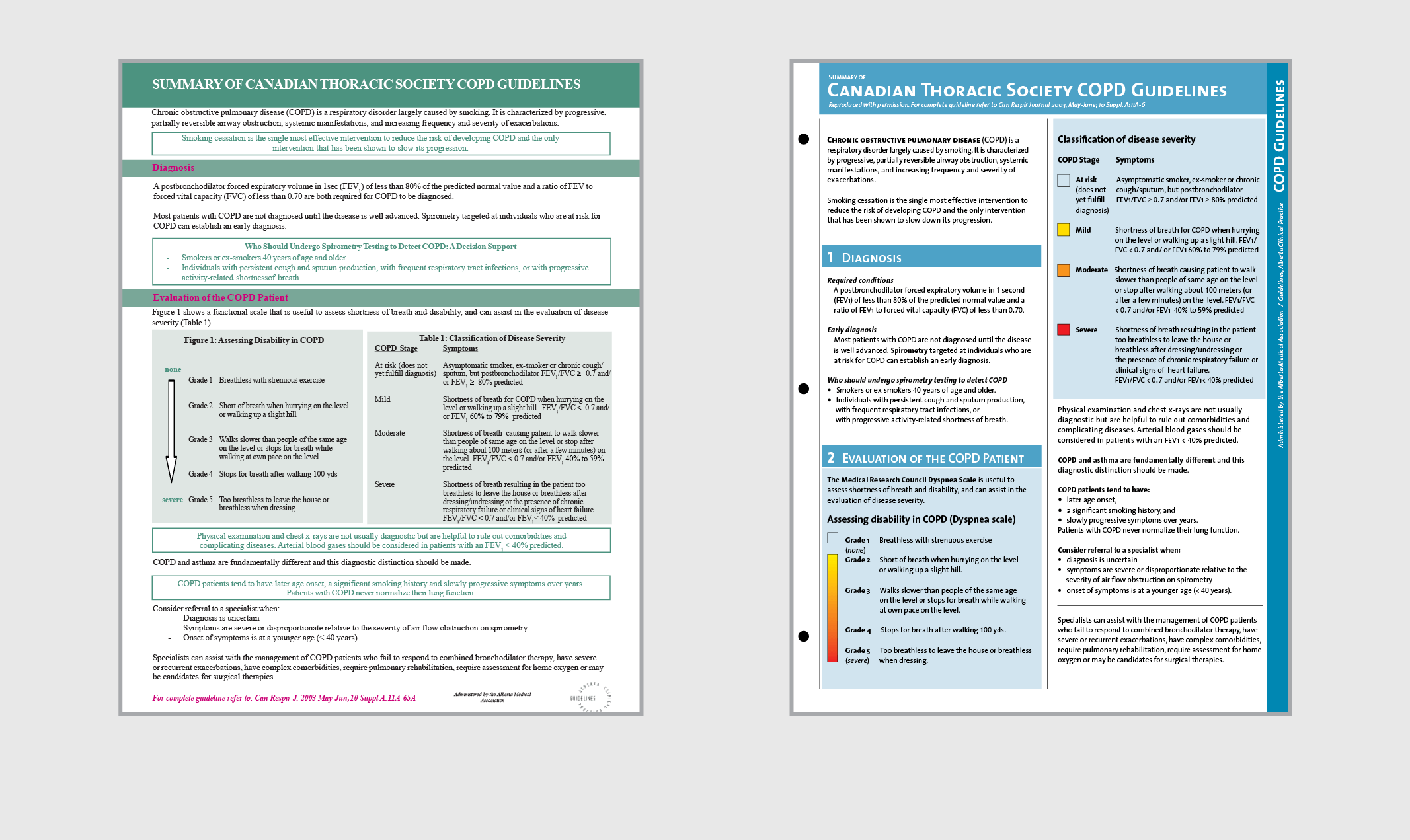
Working on the re-design of a technical document produced by pharmacists for general practitioners regarding the use of pharmaceutical drugs for a lung illness condition, I devised 34 recommendations, partly based on existing literature and partly on interviews with producers and users of the document. For an example, these are three paragraphs extracted from my report to the client that show how recommendations regarding the use of colour are supported:
“About 6% of healthy adult males (some authors say 8%), have some form of color blindness (Grether & Baker, 1972, p. 71). These people tend to confuse red with yellow and green with white, and in many situations they confuse red and green. The standard colors for danger, warning, and caution are red, orange and yellow respectively. The poor perception of red suggests not to rely on color alone. When designing a color coding system, care should be taken so that the shades (degree of darkness) are sufficiently distinct for people with severely reduced sensitivity for color. If one analyses the US Army-Navy Aeronautical Specification AN-C-56, the scale of ten spectral colors developed by Chapanis and Halsey (1956), and the US Government Federal Specifications II-C-595, one finds that they are examples of sets built in search for a reliable distinction level by all sighted people.
The colors of backgrounds affect legibility. Luckiest and Moss measured the visibility of type on 10 colors of paper, and found that only the ‘Fairly saturated yellowish red or reddish orange’ showed significant reduction in visibility, and also in reading speed. It seems that accommodation to conditions allows for a rather broad range of tonal contrast between type and ground, although black on white or on light shades of sepia, cream and buff, tend to be preferred (Luckiest and Moss, 1933, p. 25).
The visibility of black type on color ground, or color type on black ground, depends to a great extent on tonal contrast. Miyake, Dunlap and Cureton studied the ability of subjects to correctly respond to a series of brief exposures of black numerals on color paper (1930, p. 340). They found that black type read very well on white, yellow and green (I suppose, a light green), but red and green type on black ground resulted in low legibility scores (Unfortunately the colors are not reported with precision and it is therefore difficult to generalize results). Tests of reading speed show that red print on a dark green background can extend reading time by about 40%. Tonal similarity and hue conflicts are key situations to avoid when planning colored type on colored ground. Color combinations that result in poor legibility cause an increase in regressions, an extension of fixations’ duration, and therefore an increase in perception time; they increase fatigue and overall slow down the reading speed” [1].
Among other citations and discussion, the above led to the following recommendations:
“RECOMMENDATION 29. Color type on color ground should maintain significant light intensity difference to guarantee legibility (approximately 50% perceived reflectance difference).
RECOMMENDATION 30. Poor situations such as medium to dark type on black ground can significantly reduce reading speed and should be avoided.
RECOMMENDATION 31. Long texts should normally be printed black on white or off-white ground.
RECOMMENDATION 32. White type can be used on color grounds as long as the ground is perceptually 50% as dark as black, that means, equivalent to a 20% black screen. Red has been found to be twice as visible as black in regards to warnings” [1].
This led to decisions about color type and ground for the design of the document, moving away from the original design, where red titles were set on green backgrounds. Fifty sources were consulted and referenced, and 19 interviews with producers and users were held to develop the 34 recommendations that led to the new design. Testing the existing design and the new one with users, the following improvements in performance were found:
“The average time required to complete all search tasks was shorter when using the new design (77 seconds) than when using the existing one (139 seconds).
When attempting to recall the number of sections in the document, no subject was able to do this with the existing design, and all subjects were able with the new prototype.
When attempting to remember the titles of the sections, no subject was able to do so completely, but a higher accuracy was possible with the new design.
Subjects in general found the new design easier to read, and performed faster at search tasks. They also supported the color coding, the color palette, and the colors used for type.
On a scale of 1 to 5, 1 being not easy to use and 5 being easy to use, the existing sheet was assigned an average of 3.3, and the new one 4.75” [2].
Another example
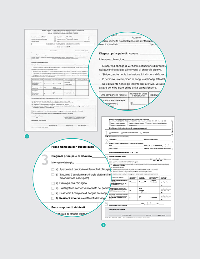
A Blood Request Hospital Form
A re-design of a hospital form I did with Guillermina Noël can be used as an example to discuss other step in evidence-based design: the articulation of a clear description of the problems found. In our case we found the following:
“ 1. Lack of information about existing records for the patient.
2. Lack of clarity and completeness of information and requests.
3. Ambiguity in some texts.
4. Inadequate sequence of items.
5. Inadequate layout.
6. Visual and textual ‘noise.’
7. Lack of support for the perceptual and cognitive tasks of the users.
8. Lack of possibility to confirm that the user had followed correct procedures.
9. Lack of instructions about how to fill in the form.
10. Inadequate slots for some items to be entered.
11. Important information was buried” [3].
This led to the decision to base our work on three basic criteria: “correctness (of the data); consistency (in the way requests and information are presented); and correspondence (between the needs of the form filler and those of the service deliverer) (Janssen & Neutelings, 2001)” [3].
This in turn lead to the development of performance specifications, another necessary step to be covered when designing documents on the basis of evidence. Performance specifications define what the document must do, as different from defining how the document must look. A document is a tool people use to achieve a given objective. People should be able to use it with ease, efficiency, and accuracy.
In our case, we decided that the form should facilitate:
“ 1. Reading all texts.
2. Finding any specific piece of information.
3. Following requests properly.
4. Filling in all the items in the form.
5. Transcribing the information.
6. Confirming that procedures and actions have been properly followed.”
“… As a result of the evaluation and performance specifications, 52 modifications were introduced, focusing on reducing the users’ cognitive efforts (Desaulniers, 1987; Frolich, 1986), making their job more efficient (Fowler, 1983) and error free. To achieve this, eight prototypes were designed through an iterative consultation process” [3].
As said before, evidence in design not only emerges from specialized literature, but also from field research developed specifically for the project in question, through interviews, tests and other research strategies involving users.
Conclusions
Evidence-based design is accountable design. It is a way of ensuring that one is making the best possible decisions by using the information available at the point of creating the design. Evidence-based design takes advantage of the hundreds of studies developed in related sciences such as psychology in its many specializations (perceptual, cognitive, behavioural, educational, etc), the study of language comprehension, anthropology, sociology, marketing, physiology of vision, and any other science that could be relevant to assist in the creation of effective solutions to design problems. Communication design is not centred on the arrangement of type and images (our means as designers), but on optimizing the human processing of visually presented information.
Evidence-based design is responsible design, it does not vary with fads and fashions or with the capricious moods of a designer. It provides a dependable service to society and, as a consequence, positions the design profession among other credible disciplines, where a vast pool of knowledge is combined with sensitivity for the particular demands of specific situations.
Evidence-based design is reliable design, that combines existing scientific knowledge with knowledge created to address the situated nature of every design project.
References
- [1] Frascara, J. Information design review project. Phase 2: Project 1. Design criteria and guidelines for the visual presentation of information. Internal report to client: Submitted to the Alberta Drug Utilization Program. 2006.
- [2] Frascara, J., and Rueckert, S. Medical communications and information design. Information Design Journal, 15(1). 2007. 44-63.
- [3] Frascara, J., and Noël, G. Evaluation and design of a blood transfusion request form. Information Design Journal, 18(3). 2010. 241-249.