This paper describes the research and theoretical orientation of the Studio for Extensive Aesthetics (SEA), which produces projects and artistic research on the aesthetic implications of technological innovation. Particularly, the studio investigates the aesthetics of the growing archive of cultural data and information produced by global networked infrastructures. The work is transdisciplinary in nature, operating through artistic and computational means. The studio is co-located with the Graduate Studies programme at Emily Carr University of Art + Design and engages art and design students with a network of international theorists and practitioners through research projects at various scales, from screen-based work to urban scale installations. The studio is funded by the Canada Foundation for Innovation, the British Columbia Knowledge Development Fund, and the Canada Research Chair programme, a federal organization that provides research positions for scholars across the sciences and humanities. I established the studio in 2014, when I was awarded Canada Research Chair in art and design technology.
One area of particular engagement at the SEA is data aesthetics and visualization. Data visualization is a fundamental tool in advanced societies, which rely on ever-increasing data flows since the transition to the digital era. Nearly every aspect of contemporary life is informed by a vast array of data collected by governments, corporations, scientists and individuals. Massive amounts of complex data lead to a signal to noise problem: using data effectively requires interpretative tools that render the data intelligible to human decision makers. In the past two decades, data visualization has emerged as an effective method of seeing meaning within large data sets. “Visualization” refers to representation in many forms, from graphs and other visual tools to sonification or haptic interfaces, but in general visualization helps make data comprehensible to humans. From mobile applications that use trends to advise purchasing decisions, to medical devices that provide real-time predictive assessments of patient conditions, data visualizations increasingly exert explicit or implicit influence over contemporary decision-making across disciplines and contexts.
The SEA engages directly with the methodology of data visualization to question the discipline. An effective data visualization depends on many related factors, including the attributes of the data collected, the interpretative algorithms employed, the chosen method of visualization, and its aesthetic aspects. Among these, the aesthetic component, which comprises both the visual aspect of the visualization and the emotional response that it engenders, has a profound effect on the way data is interpreted by a viewer and is among the most important to the overall effectiveness of communication. At the same time, the aesthetic dimension of data visualization has attracted comparatively little attention to-date and is one of the least understood by scholars, due in part to the difficulty of defining the role of aesthetics in conventional terms. As data visualization becomes a mass medium, understanding its aesthetic dimension is paramount. The research required to build knowledge in this area is transdisciplinary by nature, requiring the ability to merge traditionally disparate fields of computer science and the arts. Drawing on the fields of art, design, aesthetics, and computer programming, the SEA contributes to the growing body of research on this topic.
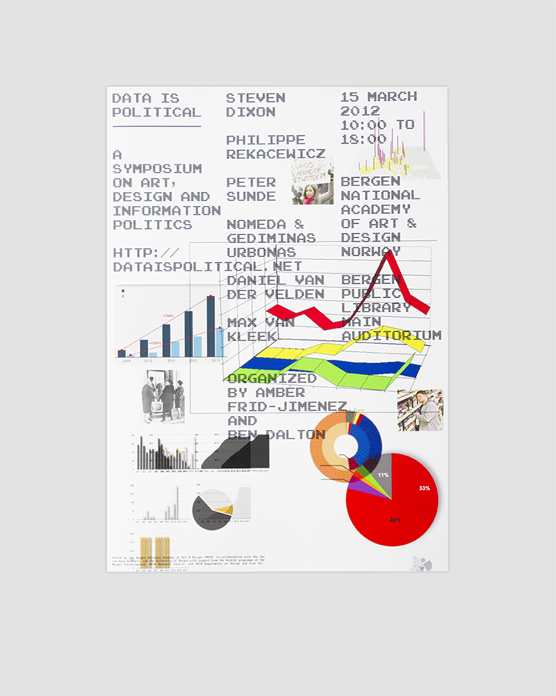
The shift to the constant use of data in mainstream culture makes it vital to recognize the power dynamics surrounding collection, aggregation, ownership, and visualization of large data sets. Michel Foucault’s assertion that knowledge is power that cannot be exercised neutrally is reflected by Melvin Kranzberg’s statement that “technology is neither good nor bad, nor is it neutral” [7, 14]. These perspectives, which have been picked up more recently by Eli Pariser and Philippe Rekacewicz, and Marian Dörk, inform my understanding of the relationships of power and control surrounding data and its use [17, 18, 5]. Institutions with the resources to house and process massive stores of dynamic data do so from within particular socio-economic contexts and cannot therefore be neutral. Through research and artistic projects, the SEA highlights these issues in contemporary culture.
The SEA exists at the intersection of art, design and scientific inquiry. It is based on a multifaceted approach that incorporates traditional scholarly research in collaboration with leading scientists, and artistic works in collaboration with industry, civic organizations, and cultural institutions. The SEA explores three primary topics pertaining to data:
- The role of aesthetic considerations in the function and affect of data visualization
- The cultural implications of data collection, ownership, and display
- The use of data-driven creative artworks that engage a wide public in reflecting on and rewriting information culture as a collaborative affair
Data visualization is becoming increasingly pervasive and influential with the rise of big data. Understanding its aesthetic and cultural implications will be crucial to making sound decisions about its uses and informing the growing number of people it affects. The SEA generates knowledge within the academic context, while experimental creative projects express that knowledge in a broader social context, engaging the public in dialogue about the data-driven interfaces that play a major role in contemporary culture.
Context
Two primary areas of inquiry inform the work of the SEA: scholarship on data visualization techniques, and the work of conceptual and media artists and theorists addressing the cultural implications of data collection, ownership, and display. The majority of scholarly literature on data visualization addresses its technical aspects, focusing on areas such as optimization, key problems of image recognition, and new techniques for visual representation of large data searches, generally with an aim of increasing efficiency and effectiveness of data interpretation [6, 3]. This approach has made valuable contributions to technical knowledge, but it offers at best an incomplete understanding of data visualization, which largely ignores its aesthetic and cultural implications. My interest in this underrepresented area of research led to founding the SEA to use research and artistic projects to investigate the aesthetics of data and its cultural implications.
Role of aesthetic considerations in the function and affect of data visualization
Although small in comparison to efforts dedicated to understanding efficiency and optimization, a growing body of scholarly literature and creative work attempts to formulate a rigorous understanding of the aesthetic considerations of data, drawing from the disciplines of computation and design. In the past decade, computer scientists such as Martin Wattenberg and Sheelagh Carpendale have noted the important role aesthetics and semiotics play in human perception of data visualizations [23, 4]. Meanwhile, media theorists such as Alexander Galloway, Warren Sack and Meredith Hoy, and designers such as Victoria Vesna and Lev Manovich speculate on the impact of data aesthetics on visual culture and contemporary art [12, 20, 13, 21, 15]. Recent inquiries into the aesthetics of computational visualization rest largely on foundational work done by Muriel Cooper at the MIT Media Lab, where the Visible Language Workshop investigated the user experience of information from a graphical perspective, creating new computational environments in which data could be experienced in new ways by users [19]. This work influenced later data designers who targeted discovery in the social and hard sciences by using visual metaphors. These include Ben Fry, whose technically accurate interactive visualizations helped scientists analyze the human genome [11]. Fry collaborated with Casey Reas to develop Processing, a visually-based programming language that has extended the abilities of information designers. Fernanda Viegas produced influential visualizations of activity on Wikipedia, translating editing activity into topographical landscapes [22]. With few exceptions, the most significant contributions in the aesthetics of visualization over the past two decades have been made by researchers with the ability to merge the disparate disciplines of computer science and design.
Cultural implications of data collection, ownership, and visualization
The work of conceptual and media artists contains valuable lessons that can be applied to produce a nuanced understanding of the cultural context of data visualization. Contemporary media artists have built on the work of early conceptual artists such as Joseph Beuys and Hans Haacke in innovative ways, applying technically adept visualizations to produce aesthetically compelling artworks that engage with cultural, social, and political issues. Kynaston McShine’s seminal exhibition entitled Information exhibited at the Museum of Modern Art in New York in 1970 was the first of its kind to take the structures of information, and its display and distribution as the subject of artistic inquiry. More recently, tactical media artists Tad Hirsch and Trevor Paglen use visualization techniques to question the treatment of political detainees by the US military and environmental impacts of industrialization. Information artist Ryoji Ikeda’s Test Patterns convert audio signals into objects and landscapes, translating normally abstract data structures into tactile environments that create a visceral aesthetic experience. Similarly, Metahaven, the Amsterdam design studio of Daniel van der Velden and Vinca Kruk, develops unsolicited branding and marketing strategies to interrogate cultural data trends such as Wikileaks, using techniques that range from physical artifacts to web-based visualizations. In some cases, the contributions of media artists extend beyond cultural issues to influence the development of technologies themselves. In notable examples such as Xerox’s Palo Alto Research Center, an influential innovation lab where early physical interfaces such as the mouse were developed, the creative explorations of artists-in-residence and creative technologists such as Natalie Jeremijenko and Stuart Card played a role in technological development [2]. Collectively, contemporary media artists use data visualization in new and original ways to create aesthetically compelling, technologically adept artworks that offer valuable perspectives on data visualization and the cultural questions surrounding its use. These works engage viewers and participants in a collective discussion about the role of data, information flows, and structures that increasingly define our society.
Methodology
Work at the SEA follows a cycle that includes preliminary research, prototyping virtual platforms and physical artifacts that are shown in public spaces or galleries, and communicating research results. This iterative design process revolves around praxis, which can be described as the joining of making and theory. The practice of ideas through experiential projects is ideally suited for investigating the aesthetic and cultural dimensions of data collection, distribution and display. Material and visual inquiry offer unique insights that augment and extend knowledge gained through analysis and writing. A multivalent approach that combines both material and visual investigations with writing offers contributions that extend beyond scientific analysis and current data science fields.
The Studio for Extensive Aesthetics creates exploratory data-driven online platforms and physical art and design installations that yield insights into the technical function and cultural use of data tools and methods. Engaging with reflexive questions, studio research addresses issues such as data ownership and inherent bias, as well as the larger cultural implications of living in an age defined by real time streams of information and global sensor networks.
Contribution to Knowledge
Fundamental changes have occurred in visualization in the past two decades due to the rise of processing power coupled with data collection on an unprecedented scale. With the rise of big data, contemporary data visualization increasingly functions as a mass medium, merging visualization with interaction design to influence lives online and off. The significant opportunities as well as danger of misuse make it imperative to study the aesthetic aspects of data visualization. Understanding these questions requires an original approach that draws from disparate disciplines of art, design and computer science in equal measure.
The Studio for Extensive Aesthetics produces art works and research that engage specialists and the general public in dialogue about the role of data aesthetics in contemporary culture, rewriting information culture as a collaborative affair. Initiating public dialogue about the role of data aesthetics is especially critical in our contemporary society, which is increasingly defined by data collection, screens and information flows.
References
- [1] Byron, L., and Wattenberg, M. Stacked graphs–geometry & aesthetics. Visualization and computer graphics, IEEE transactions on visualization and computer science, 14 (6). 2008. 1245–1252.
- [2] Card, S. K., Mackinlay, J. D., and Schneiderman, B. (Eds). Readings in information visualization: Using vision to think. Morgan Kaufmann, 1999.
- [3] DeCamp, P., Frid-Jimenez, A., Guinness, J., and Roy, D. Gist icons: Seeing meaning in large bodies of literature. Proc. of IEEE Symp. on Information Visualization (InfoVis 2005). Minneapolis, USA, 2005.
- [4] Diamond, S., Carpendale, M. S. T., Interrante V., Portway J., and Xin-Wei, S. Visualization, semantics and aesthetics. In Panel in IEEE Information Visualization, 5(2). London, UK, 2002.
- [5] Dörk, M., Feng, P., Collins, C., and Carpendale, S. Critical InfoVis: Exploring the politics of visualization. In alt.chi 2013: Extended Abstracts of the SIGCHI Conference on Human Factors in Computing Systems. ACM, 2013. 2189–2198
- [6] Eddy, J., and Lewis, K. Visualization of multidimensional design and optimization data using cloud visualization. ASME Design Technical Conferences, Design Automation Conference. 2002.
- [7] Foucault, M. The order of things. NY: Pantheon, 1973.
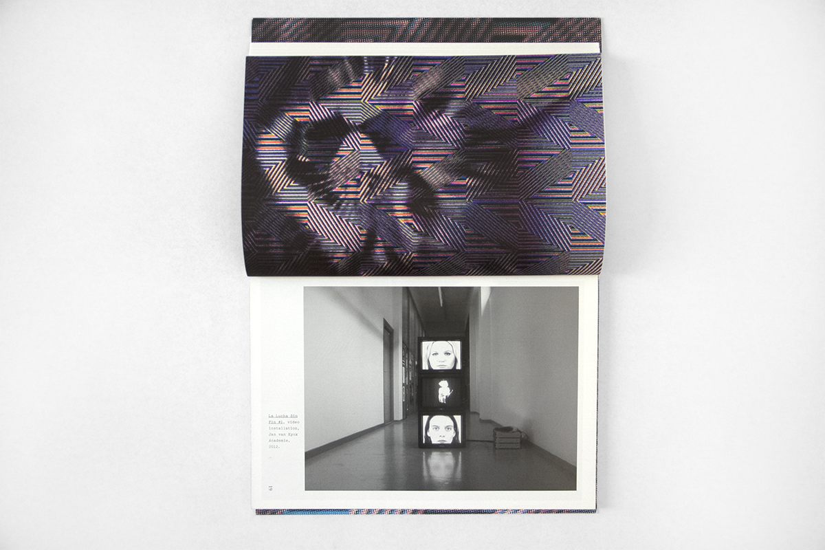
- [8] Frid-Jimenez, A. La lucha sin fin: On charisma and its persuasive technologies. The Netherlands: Jan van Eyck, 2013.
- [9] Frid-Jimenez, A., and Dalton, B. Data is political: Investigation, emotion and the accountability of institutional critique. Accountability technologies: Tools for asking hard questions. D. Offenhuber and K. Schechtner (Eds). Heidelberg, Germany: Springer-Verlag, 2013.
- [10] Frid-Jimenez, A., and Dahmen, J. Data visualization. Encyclopedia of aesthetics, (2). M. Kelly (Ed). Oxford, UK: Oxford University Press, 2014.
- [11] Fry, Benjamin Jotham. Computational information design. Diss. Massachusetts Institute of Technology, 2004.
- [12] Galloway, A. Protocol: How Control Exists After Decentralization. Boston: MIT Press, 2006.
- [13] Hoy, M. A. From point to pixel: A genealogy of digital aesthetics. Dissertation at UC Berkeley. 2010.
- [14] Kranzberg, M. Technology and history: Kranzberg’s laws. Technology and culture, 27(3). 1986. 544–560.
- [15] Manovich, L. The anti-sublime ideal in data art. Originally published as The anti-sublime ideal in new media. Chair et métal, (7). 2002. http://www.manovich.net.
- [16] McShine, K. Information exhibition research. Museum of modern art archive. 1970. http://www.moma.org/learn/resources/archives/EAD/InfoExhibitionRecordsf.
- [17] Pariser, E. The filter bubble: What the internet is hiding from you. New York: Penguin Press, 2011.
- [18] Rekacewicz, P. Radical Cartography. Presentation at Data is political: On art, design and the politics of information. Bergen, Norway, 2012.
- [19] Reinfurt, D. This stands for a sketch for the future. Muriel cooper and her visible language workshop. Center for advanced visual studies. 2007. http://cavs.mit.edu/MEDIA/Thisstandsasasketchforthefuture.pdf.
- [20] Sack, Warren. Aesthetics of information visualization. Conditions of meaning in media arts. Bristol, UK: Intellect. 2011.
- [21] Vesna, V. (Ed). Database aesthetics: Art in the age of information overflow. Minneapolis: University of Minnesota Press, 2007.
- [22] Viégas, F. B., Wattenberg, M., and Kushal, D. Studying Cooperation and Conflict between Authors with History Flow Visualizations. Proceedings of the SIGCHI conference on human factors in computing systems. ACM, 2004.
- [23] Wattenberg, M., and Fisher, D. A Model of Multi-Scale Perceptual Organization in Information Graphics. Information Visualization. INFOVIS 2003. IEEE Symposium on Symp. on Information Visualization. 2003.